Summer Special Sale - 70% Discount Offer - Ends in 0d 00h 00m 00s - Coupon code: best70

Page: 1 / 2
Total 20 questions
Exam Code: INF-306                Update: Jun 19, 2026
Exam Name: HTML5 Application Development

IT Specialist HTML5 Application Development INF-306 Exam Dumps: Updated Questions & Answers (June 2026)

Question # 1

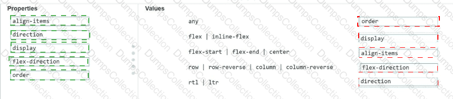
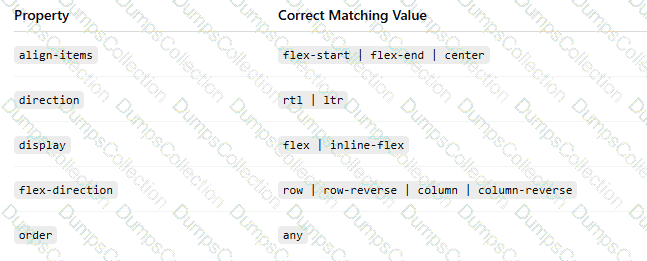
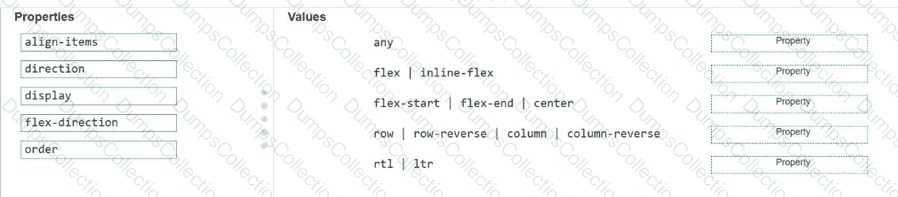
Match each property to its corresponding value for creating the CSS flexible box layout.

Move each property from the list on the left to the correct value on the right.

Note: You will receive partial credit for each correct match.

Question # 2

Which markup segment uses the output element to display the combined value of two input elements in HTML5?

A.

< form > < input type= " number " name= " a " value= " 50 " / > + < input type= " number " name= " b " value= " 50 " / > = < output name= " c " for= " a b " > a+b < /output > < /form >

B.

< form oninput= " a.value+b.value " > < input type= " number " name= " a " value= " 50 " / > + < input type= " number " name= " b " value= " 50 " / > < /form >

C.

< form oninput= " c.value=a.value+b.value " > < input type= " number " name= " a " value= " 50 " / > + < input type= " number " name= " b " value= " 50 " / > = < output name= " c " for= " a b " > < /output > < /form >

D.

< form > < input type= " number " name= " a " value= " 50 " / > + < input type= " number " name= " b " value= " 50 " / > = < output name= " c " for= " a b " > < /output > < /form >

Question # 3

You need to use a flexbox so that new content you add to the container appears at the highest point on a vertical list. You want to achieve this goal without specifying an order. Which value should you use for flex-direction?

A.

row

B.

row-reverse

C.

column

D.

column-reverse

Question # 4

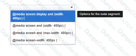
You need to correctly apply a style rule for screen devices with a width of 480 pixels or less.

Complete the code by selecting the correct option from the drop-down list.

Question # 5

What is the effect of applying the CSS float: right property to an image?

A.

It positions the image to the right of the region and wraps text around the top, left, and bottom.

B.

It positions the image to the right and wraps text to the top and bottom.

C.

It positions the image to the left and displays all of the text to the right of the image.

D.

It positions the image to the left of the region and wraps text around the top, right, and bottom.

Question # 6

You create an interface for a touch-enabled application. Some input buttons do not trigger when tapped. What are two possible causes?

A.

The input areas are using event handlers to detect input.

B.

The defined input areas are not large enough.

C.

The touch screen is not initialized.

D.

The input areas overlap with other input areas.

Question # 7

You are creating a form that requires the category to be entered as a two- or three-letter abbreviation. The input is mandatory.

You need to configure the input validation for the form.

Complete the markup by typing into the boxes.

Note: You will receive partial credit for each correct answer.

Question # 8

Which two background graphics will automatically adjust to different screen sizes? Choose 2.

Note: You will receive partial credit for each correct selection.

A.

< body style= " background:url(media/background.jpg); background-size:contain; background-repeat:no-repeat; " >

B.

< body style= " background:url(media/background.jpg); background-size:initial; background-repeat:no-repeat; " >

C.

< body style= " background:url(media/background.jpg); background-size:cover; background-repeat:no-repeat; " >

D.

< body style= " background:url(media/background.jpg); background-size:auto; background-repeat:no-repeat; " >

Question # 9

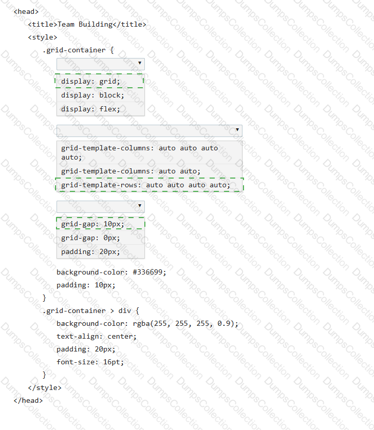
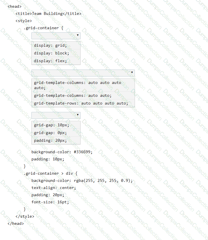
Review the grid container requirements and mockup on the left. Which markup should you use to define the grid container?

A.

Uses grid-template-columns and grid-template-rows with percentage and pixel sizing.

B.

Incorrectly places named area strings under grid-template-rows.

C.

Incorrectly places named area strings under grid-template-columns.

D.

.grid-container { display: grid; grid-template-areas: " heading heading heading heading heading heading " " menu content content content right right " " menu contact contact contact contact contact " ; grid-gap: 10px; background-color: orange; padding: 10px;}

Question # 10

You need to use CSS to create the layout shown:

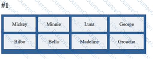
Review the layout shown on the left.

Complete the markup by selecting the correct option from each drop-down list.

Note: You will receive partial credit for each correct selection.

Page: 1 / 2
Total 20 questions

Most Popular Certification Exams

Payment


Contact us

Site Secure

mcafee secure

TESTED 20 Jun 2026